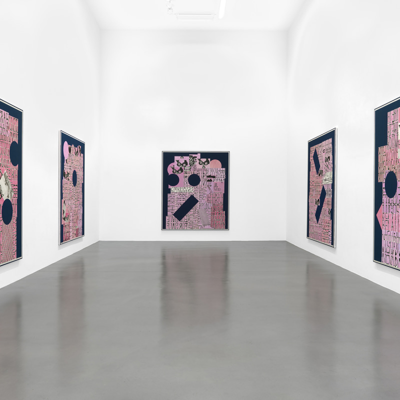
This autumn at Sadie Coles HQ, David Korty presents a group of twelve new paintings. The works mark both a continuation and a dramatic development of Korty’s Blue Shelf series (begun in 2013), in which he depicted objects on tiered ledges against backgrounds of midnight blue. In his latest paintings, words assume the place of objects. The linearity of text, rather than the horizontality of the shelf, becomes a formal and structural device.
Korty has dispensed with the stacked compartments of the Blue Shelf paintings, to present a montage of shapes – rectangular, circular, and bricklike – expanding across a deep blue field. These ‘building blocks’, variously painted and pasted onto the canvas, have been filled with hand-drawn lettering and flushed with rose-pink. In contrast to the orderly arrangements of monochrome objects found in earlier canvases (executed in dilute ink or pen on white paper), the letter-crammed shapes of the new paintings proliferate into dense amalgams, at once architectural and cacophonous. At the same time, the introduction of pink – vibrant yet ethereal against the deep blue – instils the structures with an offbeat sense of levity.
Korty uses text as both content and form. Each canvas is a bricolage of serried writing, occasionally broken by a circular aperture filled with the blue pigment of the background, or a pale area where the pink wash has been stemmed like a sunburn pattern. The words evoke the simple declarative messages of “For Sale” boards, placards, banners, glimpsed headlines and other everyday notices. Assembled into textual mosaics, they resemble the grafted newspaper cuttings of Cubist collages. And yet, rendered in carefully-ruled capitals, the words possess a studied neutrality – their angular forms (flecked by periodic smudges) take precedence over meaning. Words interrupt, judder against and override one another, to suggest multiple overlapping panels. Certain words or individual letters are reversed as if in a mirror image, or flipped by ninety degrees. The writing moves from side to side, and from top to bottom.
Merging image with text, Korty plays upon the concept of ‘movable type’ – the cast metal lettering traditionally used in typesetting – to re-present text as a thicket of cyphers. Typography functions as an abstract design. It moreover amounts to a metaphor for the underlying structure of each painting. As Korty switches between horizontal and vertical lineation – and similarly alternates between ‘front’ and ‘back’ – he traces and accentuates the perpendicular axes and double faces of the canvas itself. The lettering, in its multi-directional arrangement and standardized format, implies a grid – the organising structure of the Shelf paintings, and ultimately of any painting on a rectangular field.
In certain works, a repeated and incomplete image – a head rapidly delineated in profile, or a Venetian mask – breaks into the stacked ‘brickwork’ of lettering. The symbol of the mask aptly mirrors the structural and conceptual nuances of Korty’s works, intimating both a façade and an aperture, a proposition and an enigma.
David Korty (b. 1971, California) trained at the Rhode Island School of Design and the University of California, Los Angeles. He has exhibited widely throughout the United States and Europe. Recent solo exhibitions include those at Night Gallery, Los Angeles (2015 and 2013); Wallspace, New York (2015) and Sadie Coles HQ, London (2013). Korty’s work has featured in group shows including the Thessaloniki Biennale, Thessaloniki, Greece (2013); Painting Codes: I Codici della Pittura, Galleria Comunale d'Arte Contemporanea di Monfalcone, Italy (2006); and Painting on the Move, Kunstmuseum Basel, Museum für Gegenwartskunst, Basel, and Kunsthalle Basel (2002). The exhibition coincides with a new publication on his previous series of paintings, Blue Shelves, featuring contributions by art historian Suzanne Hudson and painter Laura Owens.
For further information please contact the gallery at +44 (0)20 7493 8611 or press@sadiecoles.com